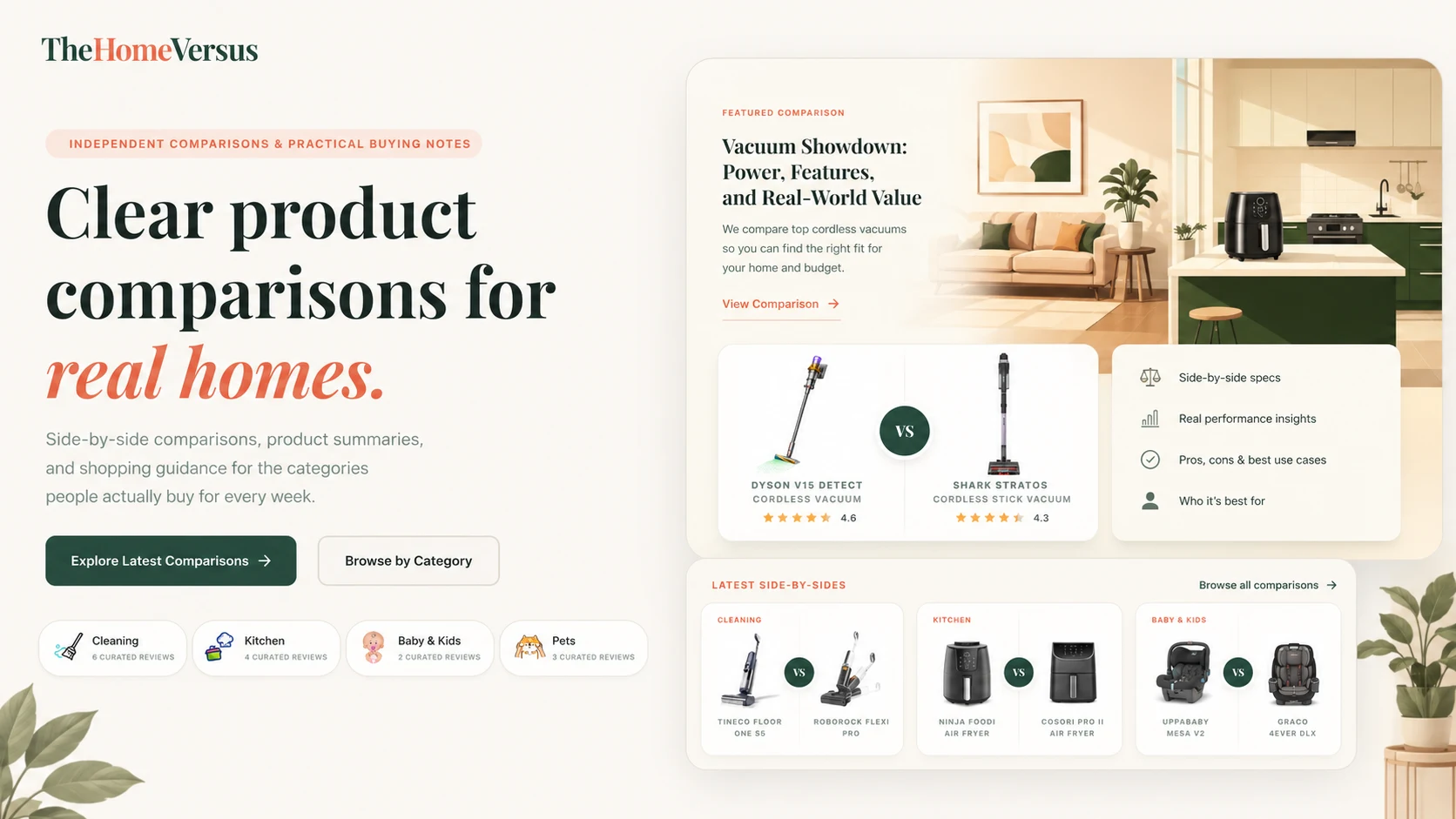
Most comparison articles are written for search engines first and readers second. You scroll past an intro, a table of contents and three paragraphs about why the category matters before you learn which product to buy. On The Home Versus we flipped the order. This is a case study of that decision.
The reader we design for
Someone landing on a comparison page has usually narrowed it down to two products already. They are not looking to learn about the category. They want a tie-breaker, and they want to know why so they can trust it. That makes the page closer to asking a friend who owns both which one they would buy again.
Anatomy of the verdict box
Every page opens with the same three-part block. If a reader leaves after it, the page did its job.
- Pick A if…Who the first product suits, in one line
- Pick B if…Who the second product suits, in one line
- The deciding trade-offThe single sentence that breaks the tie
A real example, written the way it appears on the page:
You mostly clean hard floors
and want something light enough to carry up the stairs one-handed.
You have rugs, pets or a bigger home
and can live with the extra weight for stronger pickup on carpet.
If we cannot write this block clearly, it usually means we do not understand the products well enough yet. Everything after it would have been padding.
Same information, different order
Typical comparison page
- Intro about the category
- Table of contents
- Generic buying guide
- Long spec table
- Verdict, finally
The Home Versus
- Verdict box
- One sentence per difference that matters
- Photos in real rooms
- Store links
- Full spec table, collapsed
Why tables went to the bottom
Spec tables look thorough but rarely help. Two vacuums with different suction numbers tell you very little about which one handles pet hair on a rug. A long table also hides the two rows that matter among twenty that do not.
A table answers what is different. A sentence answers whether it matters to you.
Do and don't
Do
- Lead with the decision
- Show products in real rooms
- Put store links next to the verdict
- Show a clear "updated" date
Don't
- Open with why the category matters
- Repeat the same buying guide on every page
- Add a section just to fit a keyword
- Hide the answer under a hero image
What we learned
None of this is clever. Most of the work was removing things, and the hardest part was trusting that a shorter, clearer page was good enough without one more section just in case.