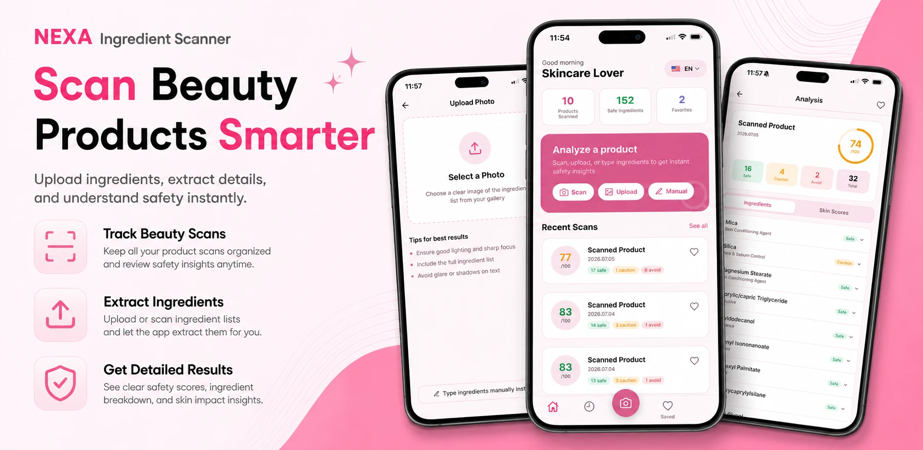
Our first version of Ingredient Scanner looked like most camera apps: close top left, flash top right, shutter at the bottom. It tested fine at a desk. In a supermarket, with a basket in the other hand, people struggled to reach anything above the middle of the screen. This is a field report on what we saw and what we changed.
The study
- Where
- Ordinary supermarket aisles, at normal shopping times. No lab, no desk.
- Who
- Us first, then friends who had never seen the app, given no instructions.
- Task
- Walk an aisle, pick up a product, scan the label, decide whether to keep it.
- What we watched
- Grip, thumb movement, and every moment someone paused or shifted the phone.
What we saw
Phones held low
Close to the body, one hand on a basket or trolley the whole time.
Top corners unreachable
People stretched for close and flash, gave up, and changed grip.
Nobody complained
They just slowed down. Friction showed up as hesitation, not feedback.
Results screen broke the rhythm
A new screen meant reaching up for back before every next product.
Test where the app will be used, not where it was built.
Everything moves down
We moved every control into the bottom third of the screen, inside the area a thumb reaches comfortably. Close became a swipe down that works anywhere on screen. Flash moved next to the shutter.
Results without leaving the camera
A successful scan used to open a new results screen with a back button in the corner. Now the result slides up over the camera view. Swipe it down and the next scan is ready.
- Scan labelShutter at the bottom
- Result slides upOver the camera, no new screen
- Swipe downDismiss from anywhere
- Next productCamera is already open
Fewer words on the result
The first result card listed every ingredient on the label. It was complete, and almost nobody read it in the shop. Now the card leads with a short verdict, shows the two or three ingredients that matter for the user's own preferences, and keeps the full list one tap away for later.
Design principles we kept
Reach before looks
If a control is out of thumb reach, it does not matter how it looks.
Stay in the loop
Every action should leave the user ready for the next scan.
Admit bad photos
When a label is blurry, ask for another shot instead of returning a confident answer built on a bad image.