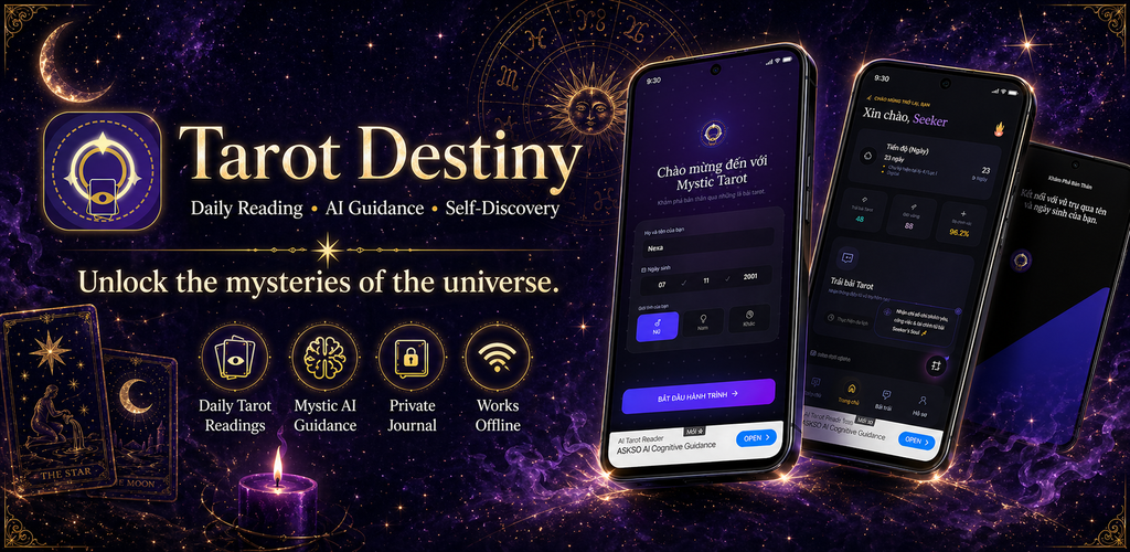
Store screenshots are the only part of an app most people will ever see. They decide whether someone installs, often in the few seconds it takes to scroll past. Our first set for Tarot Destiny was accurate and completely forgettable. Here is a frame-by-frame look at the redesign.
What was wrong with the first set
Each screenshot answered "what does this app have": daily card, spreads, journal, history. That is the question people ask last, if at all. The questions they ask first are "what will this feel like" and "is this for me".
Separate ads, not a set
Every frame had a different background, so the row looked like five unrelated images.
Captions named features
"Journal" tells you a screen exists. It does not tell you why you would open it.
Frame one needed the others
In search results only one or two frames show. Ours made no sense alone.
Placeholder content
A few screens showed sample text that made the app look unfinished.
The new set, frame by frame
- Card revealSays what the app is
- ShuffleStart of a reading
- DrawChoose a card
- MeaningThe interpretation
- JournalSave it for later
| Frame | Job | Caption style |
|---|---|---|
| 01 · Reveal | Sell the whole app on its own | What the app is, in plain words |
| 02 · Shuffle | Invite the viewer in | Second person, present tense |
| 03 · Draw | Show interaction | One short action line |
| 04 · Meaning | Show the payoff | What you get from a reading |
| 05 · Journal | Give a reason to come back | Habit, not feature name |
A feature list tells people what they could do. A story shows them doing it.
Rules we now follow
Do
- Make frame one work alone
- One idea and one short line per frame
- Use real content in every screen
- Keep one background family across the set
Don't
- Label frames with feature names
- Use lorem ipsum or empty states
- Write captions too small for a thumbnail
- Treat screenshots as the last task
Timing changed most
We used to make screenshots at the end, as a packaging task. Now we sketch the screenshot story early. If we cannot describe an app in five frames, the product itself usually is not focused enough yet.